What better way to get inspiration for your About Me page than a curated list of About Me page examples?
After all, your About Me page is one of the most important parts of your blog. It’s where you can show your readers who you are and what you do.
A well-written About Me page can:
- Impress your visitors
- Define your brand
- Build trust and credibility
- Stand out from the crowd
But how do you create an amazing About Me page for your blog?
About Me Page Examples
Well, we have a complete guide for getting the job done that you can read right here. And to give you some inspiration, we’ve collected 19 about me page examples for blogs from different niches. They all have one thing in common: they tell a great story.
And, along the way, we’ll distill a few tips from each of these page examples to inspire your own masterpiece.
1 Kindlepreneur

He’s selling himself.
That might go against everything you’ve heard when it comes to making content. After all, isn’t it all about the customer? When it comes to the About Me page, you can throw that rulebook out. This page is all about establishing your credibility in a world where trust is very important — 58% of people will buy or advocate for brands based on their beliefs and values.
Dave starts with a clear introduction of what the site is all about, then shares the compelling story of how he got there. Along the way, he presents clear calls to action (CTAs) and also positions his products and services as the solutions to your self-publishing problems.
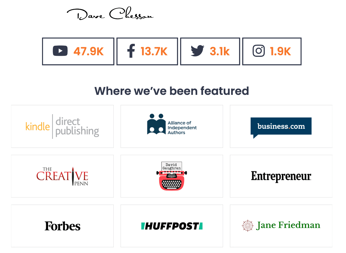
Dave finishes up with professional and social proof to show that other people value his work:
This example is a blueprint you can return to again and again as you build your own About page.
If there’s a single overall lesson to learn here, it’s to give your visitors everything they need to know, and prove that you have authority and credibility in your niche.
2 Fit Men Cook
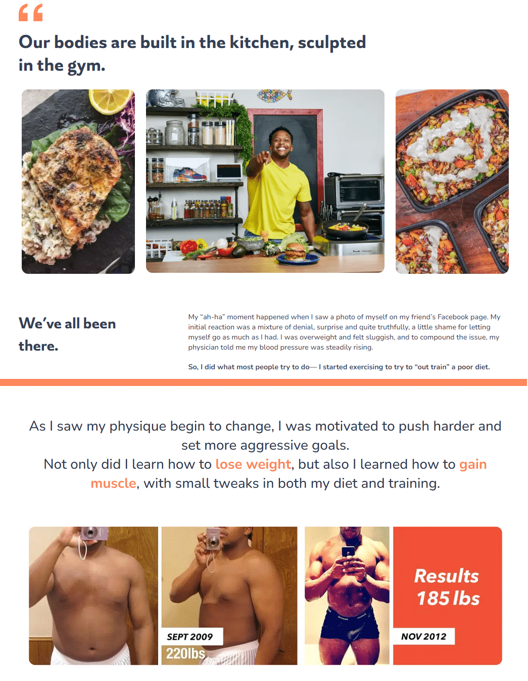
The juicy food pics might be the first thing you notice when you land on this About page. But it’s Kevin Curry’s story that keeps you glued in place.
Of course, there are tons of fitness blogs on the internet.
What makes Kevin different is that he has documented his entire journey, from fat to fit, right on his blog. He has even shared the workout routines, recipes, and lifestyle tips that kept him on track.
His About page recaps it with high-quality photos, including prove-it before-and-after pics.
It’s a winning recipe that can work for many types of blogs: share your life experiences, prove your results, help others get there, too.
3 Career Contessa
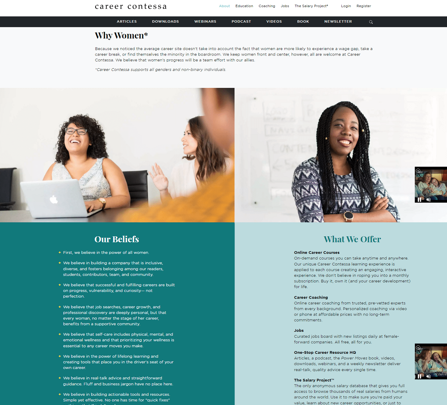
Lauren McGoodwin started Career Contessa in 2013 because she couldn’t find career information focused on the specific needs of women. So she decided to create the resource she had always wanted to have.
That tight focus on a very specific core audience shines through on this About page, from the images to the “Why Women” mission statement at the top.
Career Contessa also does a great job of making their beliefs and offerings very clear and visible using two lists of bullet points, side-by-side.
The takeaway here is: if you have a clear target demographic for your website, make sure your About page reflects that. Use every element, image, block of text and widget on your About page to show them who you serve and why.
4 Mikke Goes Coding
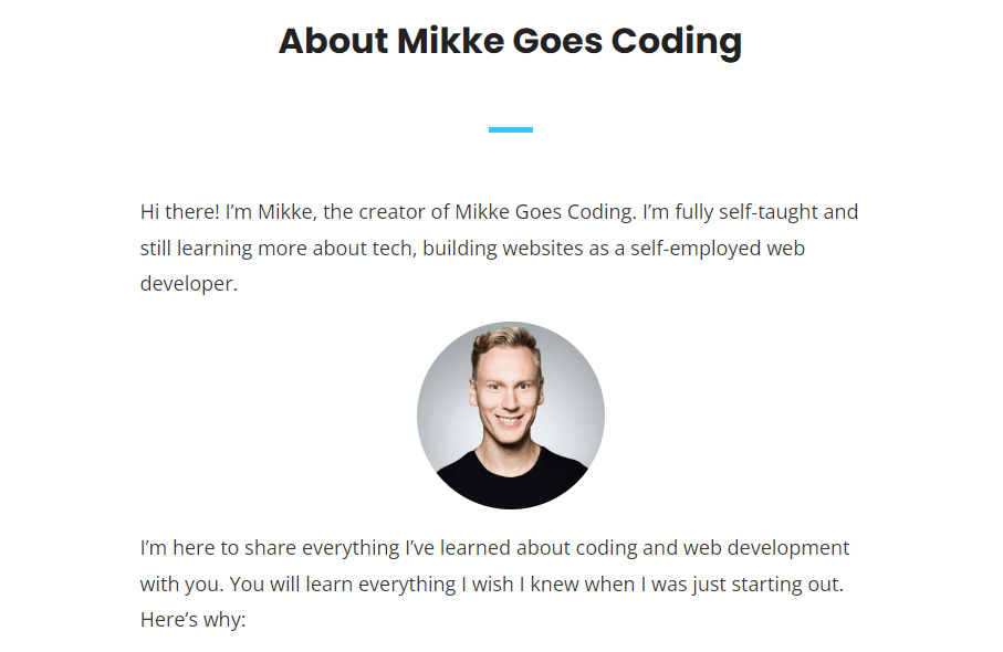
This About page is simple but effective. It tells the story of how Mikke became a self-employed web developer from scratch.
It’s a story that inspires anyone who wants to make a big life change. And on a psychological level, people connect through stories.
But it’s not just a story. It’s also a guide. Mikke gives tech tips along the way, and makes you want to learn coding, too.
The page wraps up with a call-to-action to binge-read all his posts.
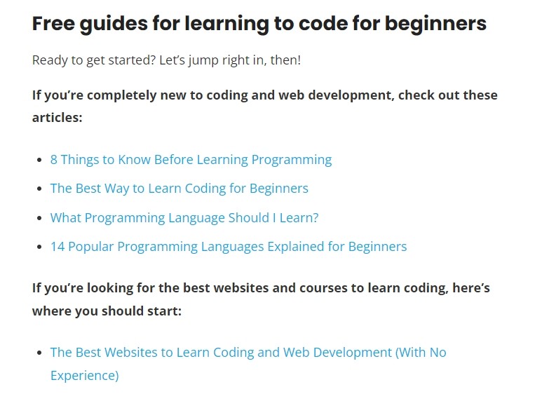
It’s a compelling lesson in how to connect with your audience and then showing how you can help them. Simple, but powerful.
You don’t have to follow Mikke’s example to reap benefits, either. Even one well-placed link from your About page to a relevant blog post on your site can help keep your visitors engaged.
5 The Shoe Snob Blog
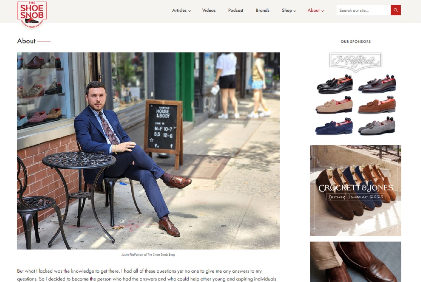
One glance at the About Me page and there’s no mistaking The Shoe Snob Blog is all about high-end men’s footwear. The hero shot of a dapper Justin FitzPatrick clad in a crisp suit and donning a slick pair of lace-ups sets the mood.
On his page, Justin tells the story about how he became a shoe snob himself, dropping details of his training. So you get a good sense that he knows what he’s talking about.
Even the page layout and sponsor ads get you primed to learn more about expensive shoes.
All in all, it’s a carefully curated example of how to set visitor expectations and then start building on them.
When you’re trying to set the mood, consider every element of your page from pics to fonts to page layout.
6 Bold & Gritty
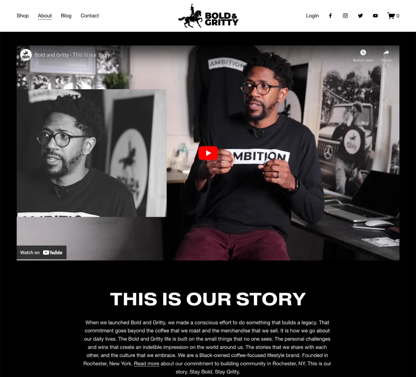
The About page of Bold and Gritty uses a powerful tool — a video introduction from its founder, David A. Paul. This clever use of media not only puts a human face to the brand but reinforces that they’re about more than just coffee and merch.
They’re on a mission to share authentic stories, celebrate the work and struggle that goes into success and build a like-minded community.
Video can tell this sort of story like no other medium, which is one of the reasons we all watch so much of it. In fact, DemandSage reports that video will account for 82.5% of all internet traffic this year (2023).
And the power of video is that it turns characters in a story to tangible human beings, helping to communicate the bold, gritty authenticity that this brand is all about.
If you can tap into the storytelling power of video on your About page, you’ll instantly have a leg up on your competition.
7 That White Paper Guy
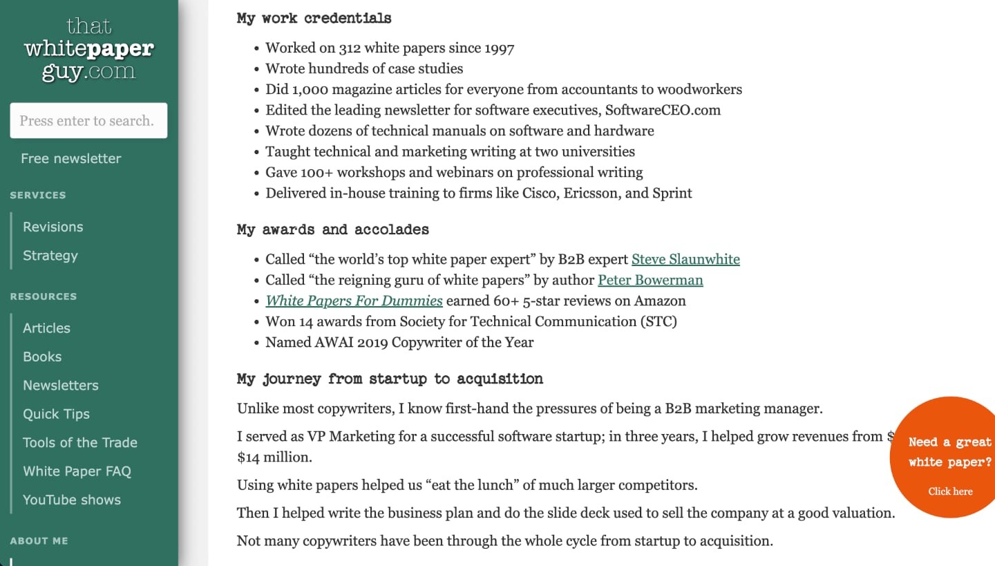
Gordon Graham makes his living writing white papers, long-form pieces of content that companies use to promote their products and ideas. They’re usually a combination of fact-telling and marketing.
Graham also runs ThatWhitePaperGuy.com, teaching other writers how to succeed in the white paper market. He offers his services to potential clients through the site, too.
And his About page? It’s essentially a white paper that details his professional experience.
So, Graham tells visitors about himself by showing them exactly what he can do for them. It’s both subtle and ingenious.
He even uses typescript to enhance the journalism feel of the site. And the orange CTA ball rides along with you as you scroll down the screen, inviting you to contact him when you read something you like.
Though not a one-size-fits-all strategy, transforming your About page into a sample of your work can be one of the most potent self-promotion tools.
8 Writing the Future of Health
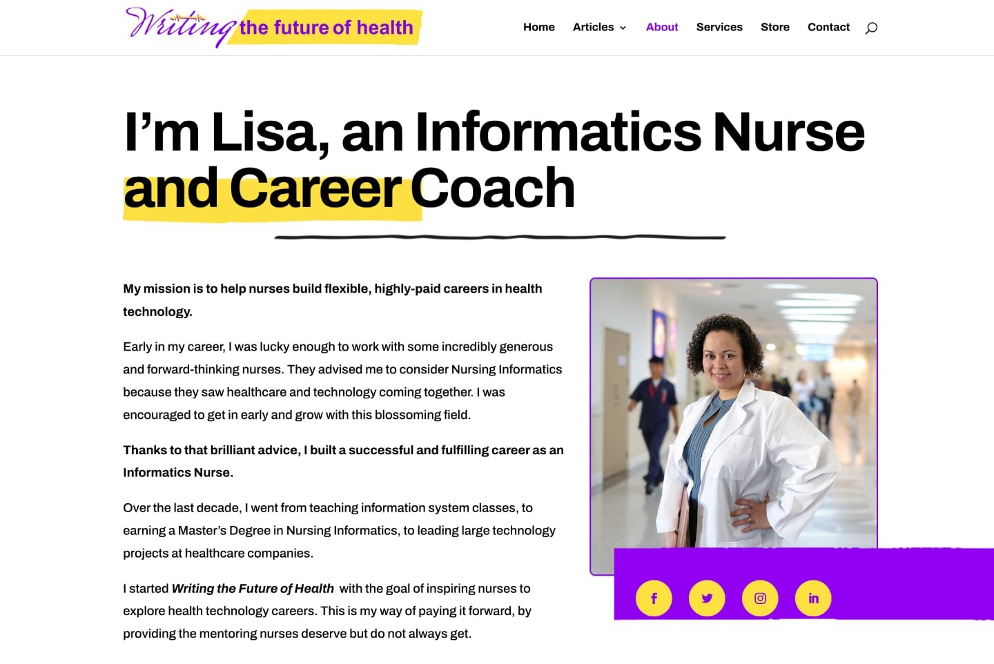
Lisa Brooks grabs your attention right away with the bold color scheme and clean layout of her About page at Writing the Future of Health.
But it’s her headline that really makes her stand out from the crowd. How many informatics nurses do you know who are also career coaches?
And if you were a nurse thinking about jumping into technology, don’t you think Lisa would look like just the person who could help you out?
Sure seems that way, and the personal story that fills out the rest of her About page backs that up.
Take a note from Lisa’s playbook and use your About Me page to stand out from the crowd. Experiment with bold fonts and colors, and put the thing that makes you different (and better!) front and center.
9 Temple Gym

With its gritty black-and-white photos of sweaty men slinging rusty, grimy iron, this About page design makes you feel like you’ve stumbled into a dungeon.
And that’s exactly what Temple Gym’s core audience of hardcore lifters is looking for. In fact, Temple became known to thousands of bodybuilding fans as “the dungeon” in the 1990s.
That’s when six-time Mr. Olympia Dorian Yates was the most popular figure in the sport, and Temple was his home. No surprise, then, that this page also spends some time on Dorian, complete with retro training photos that will stoke nostalgia for 1990s lifters.
Overall, Temple is masterful at letting their target audience know they understand them to the bone. It’s a solid lesson to keep in mind when building your own About page.
10 Karen Pryor Academy
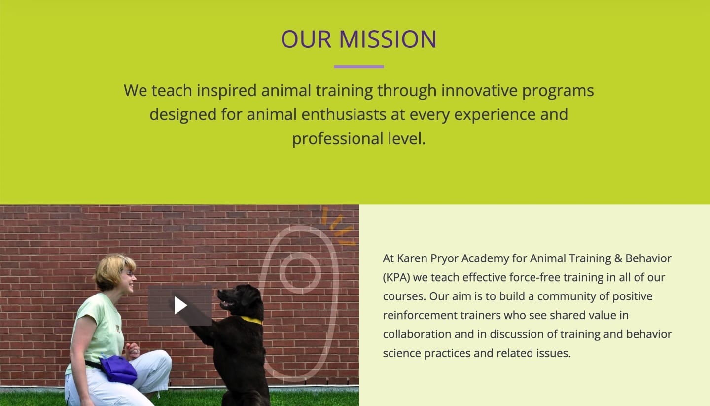
This About page is pretty simple, but it hits a couple of key points.
First, it clearly establishes the mission of the Karen Pryor Academy — a resource hub for animal lovers seeking training advice.
And second, it offers an engaging video preview of what pets undergo in the program.. As pet parents always want their little ones safe and happy, such transparency is invaluable.
Transparency fosters trust in any business, and giving audiences a sneak-peek of what they’re diving into is often appreciated. This could be through a quick video like Karen’s, a written sample, a soundbite, or even an insightful white paper about your venture
Can you think of other ways you could peel back the covers a bit on your About page?
11 Tom Rizzo
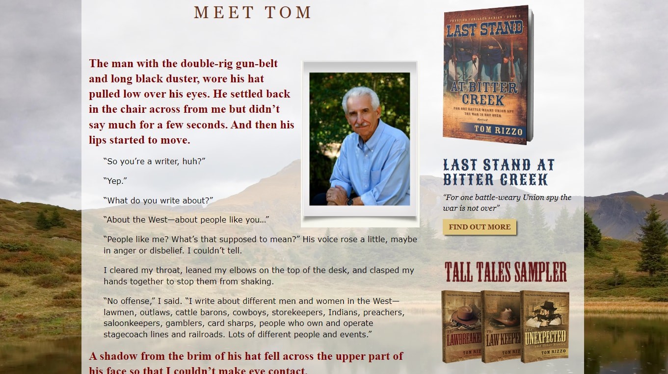
All of the About pages on our list tell a story of some sort. But Tom Rizzo’s takes it a step further by telling an actual story.
Rizzo, an accomplished fiction author who specializes in westerns, instantly drawsyou into his world. His About page is a western short story starring…Tom Rizzo, author.
By the time you’re finished reading this page, you want to hear more from Tom. And he gives you that chance with CTAs and sample book covers all over the place.
You may not turn your About page into a short story like Tom did. But you can still use effective storytelling to immerse your visitors in your world and make them want more.
12Mercola.com

This About page establishes the site’s authority and expertise, first and foremost. Right there at the top of the page, you can see that the founder of the site, Dr. Joseph Mercola, is a board certified osteopathic physician (DO).
He’s also a New York Times bestselling author and lists some impressive-sounding awards and memberships. Writing in third person gives this page an added air of professionalism.
Have similar credentials in your field? Leverage them to fortify your About page. It’s a great way to instill trust in your audience and goes a long way toward satisfying Google’s E-E-A-T guidelines.
13 Ran Art Blog
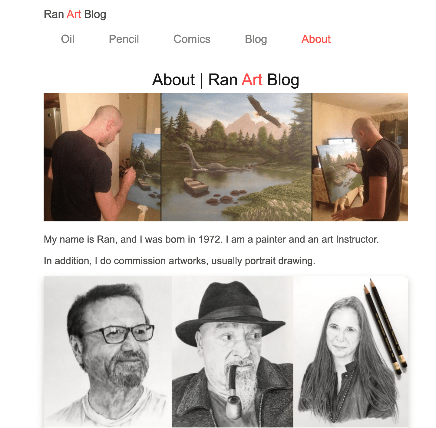
Ran doesn’t say a whole lot about himself on the About page for his Ran Art Blog. Just a birth year and a mention that he’s a painter and art instructor.
Then, he just jumps right into his portfolio and lets his art do the talking for him. It’s super simple but also very effective for letting prospective buyers know what Ran is all about and what they can expect.
Further down the page, Ran includes some work that his students have done. Another perfect bit of insight for anyone who wants a glimpse into Ran as a teacher.
If you, too, have work you can showcase related to your site, the About page is a great place for it to live. This approach would work well for a graphic designer or anyone else with creative projects to show the world.
14 Professional Sports Authenticator (PSA)
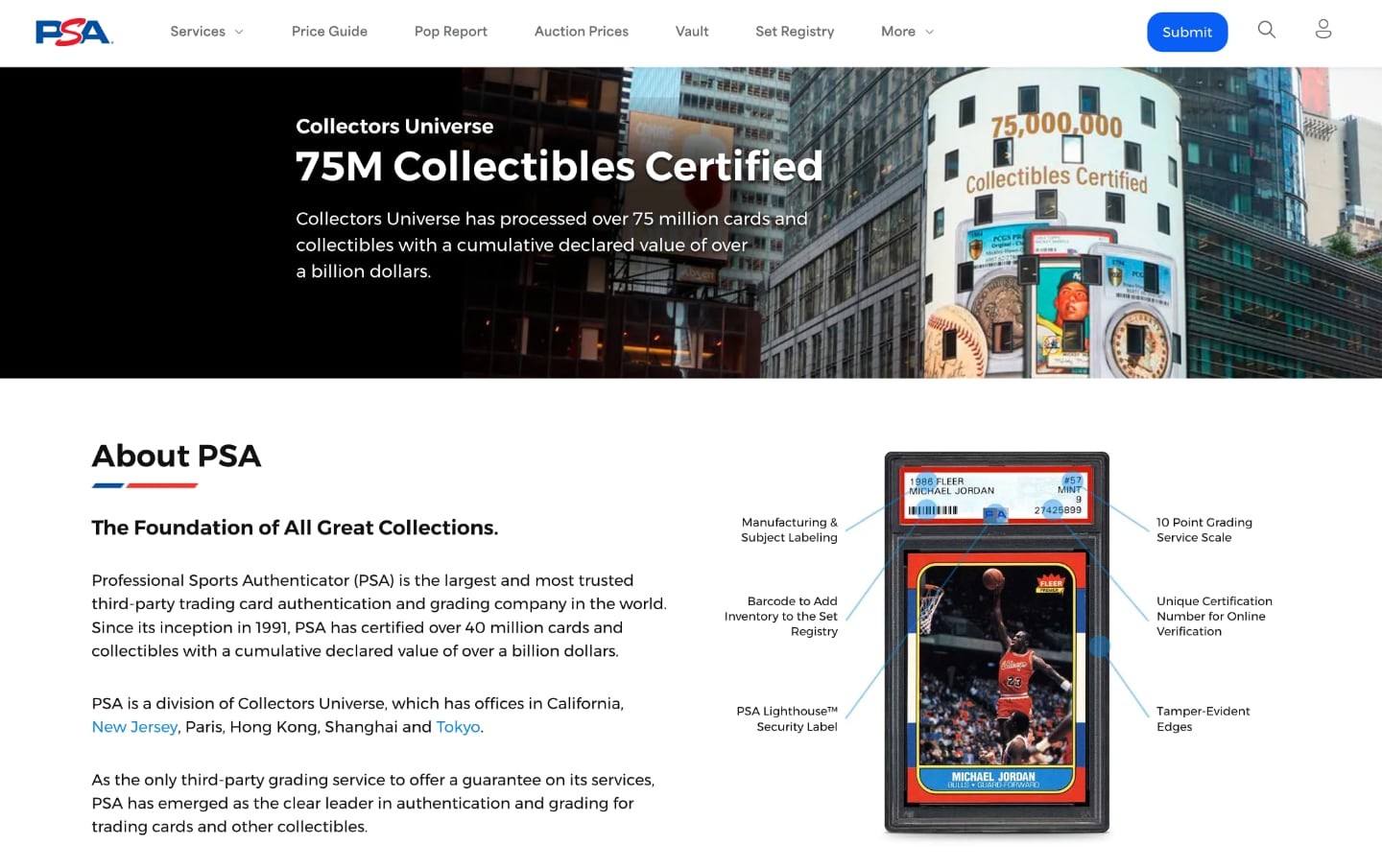
This About page hits you square in the teeth with a stunning number — 75 million collectibles certified!
It’s a bold statement that reminds collectors how dominant PSA is among card grading companies.
They don’t rest on that single (huge) number, though. Instead PSA backs it up with the story about how they pretty much started the whole graded-card movement.
And they showcase two hobby icons with one mouth-watering image, featuring a Michael Jordan rookie card in the iconic PSA holder. They even provide a mini-tutorial by noting the key aspects of the graded card with highlights and pointers.
This is a textbook example of how you can use statistics and imagery to show that you’re the best, or at least different from everyone else in your niche.
15 Greencastle Pediatric Dentistry
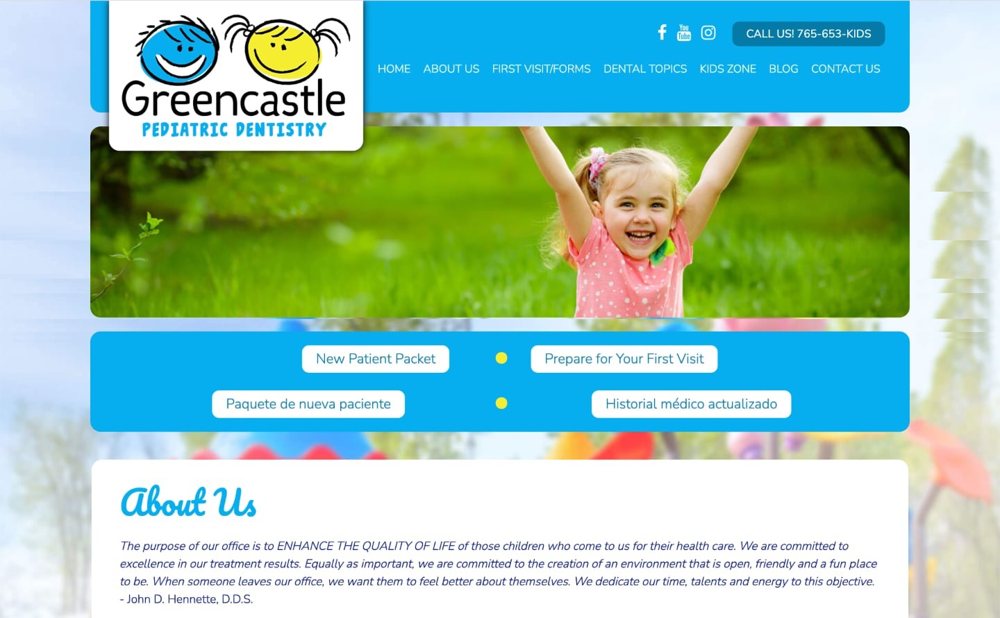
Greencastle Pediatric Dentistry gets down to business right away by showing parents what they want to see — a happy kid.
From here, the About page smoothly transitions into an upbeat biography of Dr. John D. Hennette, accompanied by his photo. It concludes with a group shot of the friendly team parents and kids will meet when in need of dental care in Greencastle, Indiana:

They seem like the kind of people you’d want around if your little one was anxious — comforting and welcoming.
This About page plays to the emotions involved in the business of pediatric dentistry and does its best to reassure parents. If you can show that you, too, understand your audience’s emotional needs, you can make a meaningful connection that lasts.
16 Paternal Damnation

Not every About Me page needs to be a work of art or make a profound statement to be effective.
Sometimes, the best way to connect with your audience is to show them that you share their pain points. Let them in on your journey as you fight to be better and help them do the same. And, if you can inject a little humor and laugh at yourself along the way, all the better.
That’s the approach that Robbie at Paternal Damnation takes.
From the devil-clad images to made-up quotes about the dangers of positive pregnancy tests, his About Me page hits home with most parents. He gives a comic voice to the helplessness that so many are afraid to express and takes us on his journey toward being a better dad.
Some great ways to add a bit of humor to your About Me page include pics, drawings, anecdotes, jokes, and even your general tone of writing.
17 John the Plumber
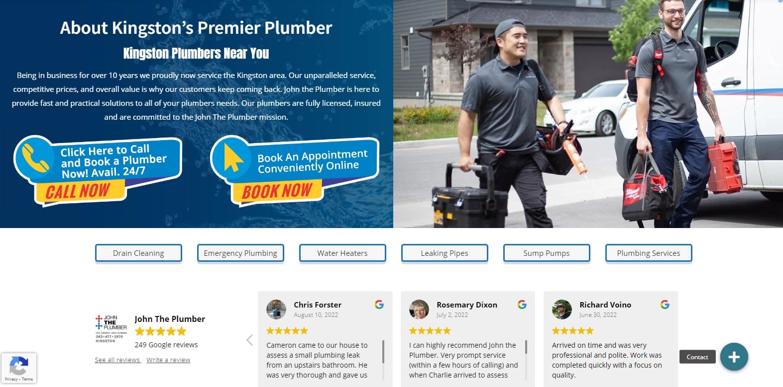
Sometimes, the best person to tell your story isn’t you; it’s your customer, particularly if you’re in the service industry.
Take John the Plumber, for example, whose About page starts off with basic information about the company. The pic of a couple of friendly plumbers is inviting, and the contact information is in your face, which is helpful.
But the most powerful part of this page is the slideshow of customer reviews just above the fold. Here, John lists their overall Google star rating and then gives the floor to several satisfied customers.
These testimonials even include faces and names, which really gives visitors the sense that this is a company that helps real people and can be trusted.
If you have happy customers willing to sing your praises, an About page is a great place to give them that chance.
18 RC Cola
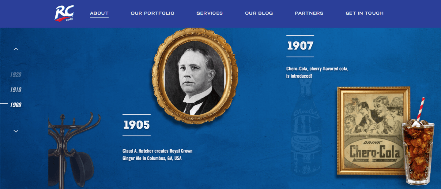
Most people already know RC Cola as the “other” cola brand that was never really able to compete with Coke or Pepsi. But RC has carved its own niche and remains popular more than 100 years after it was founded.
RC has that history on full display on their About page, which features an innovative graphical timeline. Here, you can click through the decades to see vintage photos and learn more about the company.
It’s a super engaging page, and you’ll probably end up clicking your way from 1900 all the way through 2023. You’ll definitely come away with a deeper appreciation for RC, which is the whole point, right?
You don’t necessarily have to use a timeline, but making your About page more interactive will also help make it more memorable. Quizzes, surveys, games, and interactive graphics are all options to consider.
19 Multicultural Kid Blogs
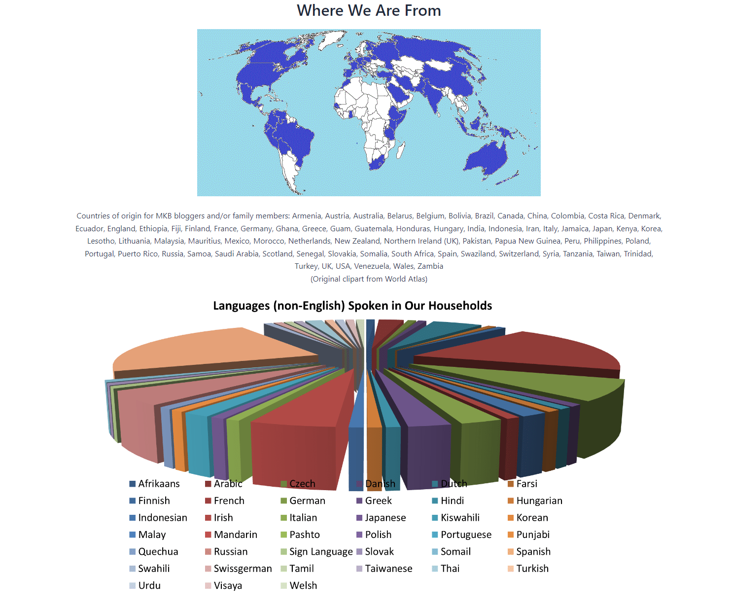
The Multicultural Kid Blogs About page presents a clear mission statement right upfront and lets you know they’re a global community.
But they really drive that message home with the two graphics that follow. You can see at a glance that their bloggers come from just above every corner of the globe. And the variety of native languages they cover is astounding.
In many cases, like this one, the graphical representation of facts is much more impactful than the written word.
Are there parts of your story that you could represent with figures and diagrams to make your About page really stand out, too?
Conclusion
Not all of these About Me page strategies will fit your own blog exactly. But each page example above offers at least a couple of nuggets that will inspire any site owner.
The good news is, the bloggers above have done the leg work and figured out how to build About pages that resonate with their readers.
Now, all you need to do is choose the tactics and techniques that line up best with your site.
If you already have an About Me page, you can use these great examples to improve your page.
And if you’re starting out, then use these as inspiration to build the kind of About Me page your readers find irresistible.
If you want even more details about starting a blog the right way, I highly recommend you attend our free training webinar.

